
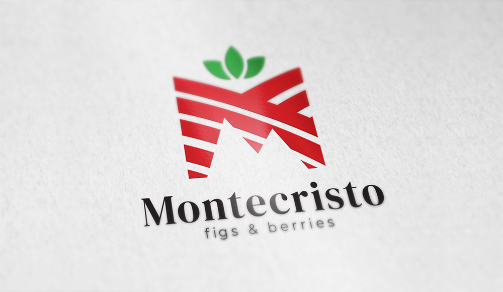

Montecristo is an exporting enterprise dedicated to the distribution and sale of organic berries. Its key value is based on the quality and origin of the product, as well as its preservation. Their aim is to provide consumers the best experience in taste and texture.
The logo combines the transitional serif font, thereby maintaining the classic essence so important for the company. The modernist design is found in the descriptive text with a Sans typography in English: Berries & figs, given their focus on exporting the products to the United States.
On the other hand, the icon represents the mountain, as well as the name of the brand does. A crop field alludes to the letter M, using the leaves at the top to simulate a berry.
Tags: Graphic Design, Branding, Corporate Image, Logo
June 3, 2020

